

Michel Pastoureau, in his fascinating book Bleu. Histoire d'une couleur (Seuil, Paris, 2000), reminds us that in the West, throughout Antiquity and the High Middle Ages, blue was a colour ignored or despised. Then, from the 13th century onwards, a reversal can be observed and, gradually, blue occupies a place of predilection in literary and artistic creation. Over the
centuries, emblematic examples include the ultramarine blue of Giotto's frescoes in the church of the Arena in Padua, but also the luminous blues of the religious paintings of the Jansenist painter Philippe de Champaigne, which symbolise the light of the sky. Delacroix, interested in the existing correspondences between notes and colours, praised the "blue note" present in Chopin's music. This same note that would give its name a century later to the famous jazz label "Blue Note Records".
Returning to the field of art history that concerns us more particularly, blue in the twentieth century has been the subject of almost exclusive attention by a number of artists. One thinks of course of Picasso's blue period, from 1901 to 1903, where blue embodies sadness and misery. But we could also mention the German expressionist movement of Blaue Reiter (the Blue Rider), founded by Franz Marc, August Macke and Kandinsky in 1911 in Munich, whose title indicates the prominent place he gave to the colour blue. As for Yves Klein, who had declared "The blue sky is my first work of art", he invented and patented the famous IKB blue in 1960, made famous through his monochrome paintings. We cannot forget the painter of narrative figuration Jacques Monory who, in order to keep reality at a distance or to colour the coldness of the black novel that inspired his compositions, permanently bathed his paintings in a monochrome blue background.
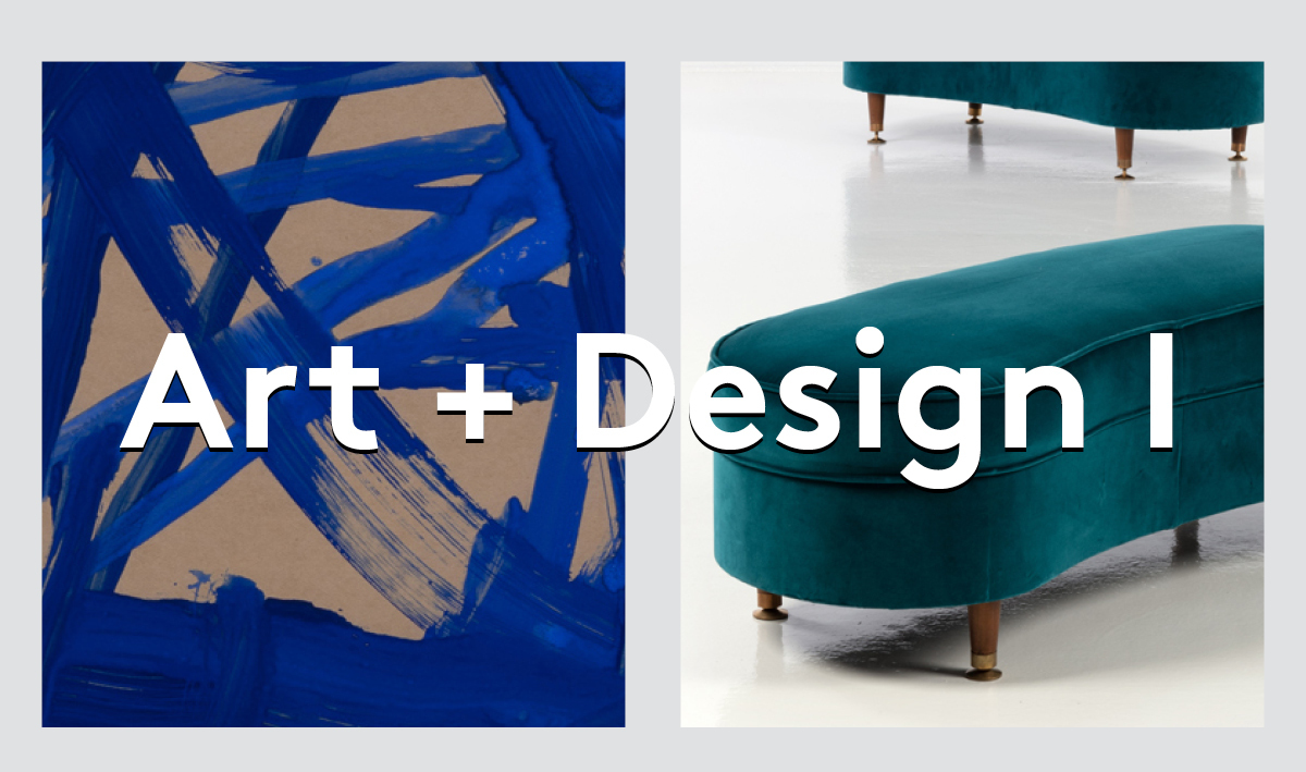
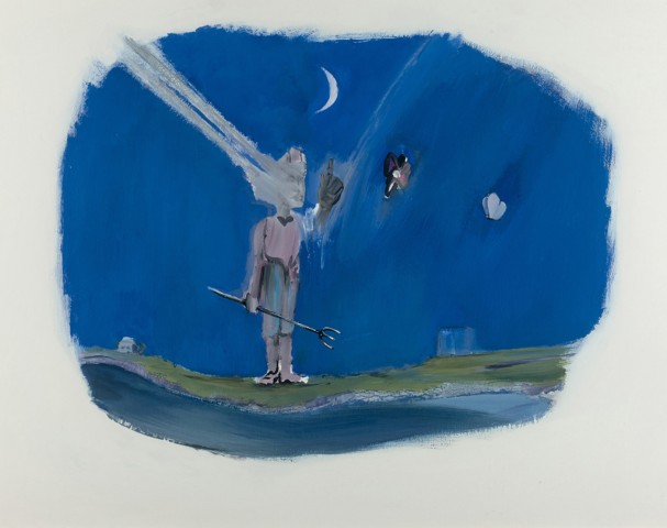
In the "ART + DESIGN I" sale organised by PIASA from 23 to 28 April, the colour blue gives an astonishing singularity to the works gathered together. Two touches of blue are the anchor point of the Personnage au chapeau by Arroyo, while the expressionist power of blue was exploited by James Brown in a series of works on paper from the mid-1980s. The eminently symbolic charge of this colour is associated with its decorative quality. It is therefore not surprising to find it widely used in the many materials employed in design in the second half of the 20th century. This is the case with the glazed stoneware that Rigmor Nielsen uses for his lamp. Heir to a thousand-year-old tradition, Max Ingrand shades the glass blue with Model 2218. Inspired by geometric aesthetics, André Sornay (1902-2000) assembles colours on the surface of the furniture he designs, here a cabinet in wood, Isorel and metal.